How Tooltip Software Transforms Enterprise Software Adoption
A tooltip is a small contextual overlay that helps users understand software features in real time. Learn what tooltips are, how they work, and how tooltip
A tooltip is a small contextual overlay that displays a brief label or description when a user hovers over, focuses on, or taps a user interface (UI) element. In enterprise software, tooltip software goes further: it delivers role-specific, in-application guidance that reduces friction, cuts support costs, and accelerates adoption. The sections below explain what tooltips are, how they work technically, and how organizations use them to solve real software adoption challenges.
What exactly is a tooltip?
A tooltip is a non-modal, non-blocking overlay that provides supplemental information about an interface element. According to the U.S. Web Design System (USWDS), a tooltip is "a short descriptive message that appears when a user hovers or focuses on an element" and should be used to strengthen an existing message rather than replace it. Tooltips are sometimes called infotips, hints, mouseover text, or hover text. In accessibility standards, the ARIA (Accessible Rich Internet Applications) specification defines a dedicated tooltip role for exactly this pattern.
Tooltips differ from modal dialogs or inline help panels in three key ways: they do not block the rest of the page, they do not require a user action to dismiss, and they contain only a short piece of supplemental text rather than a full explanation.
What do tooltip examples look like in practice?
Understanding the range of tooltip samples across different contexts helps clarify where they add the most value.
Password tooltip example
One of the most recognized tooltip examples is the password field on a registration form. When a user focuses on or hovers over the password input, a tooltip appears listing the required format, such as minimum length, uppercase requirement, or special character rules. This is the classic input tooltip pattern: it delivers just-in-time guidance exactly where the user needs it, without sending them to a help page.
Enterprise software tooltip example
In a CRM (Customer Relationship Management) or ERP (Enterprise Resource Planning) system, tooltips can appear on field labels to explain what data is expected, on buttons to describe the action they trigger, or on status indicators to define their meaning. This reduces the volume of basic support tickets because users can self-serve the answer without leaving the screen.
Bootstrap tooltip style and styling
For developers building web applications, Bootstrap tooltip style refers to the visual and behavioral conventions provided by the Bootstrap front-end framework. Bootstrap tooltip styling can be customized through CSS (Cascading Style Sheets) variables and data attributes to match a product's design language while retaining the framework's built-in animation and positioning logic.
What challenges does tooltip software address in enterprise adoption?
Enterprise software adoption consistently runs into the same obstacles. Tooltip software is designed to address each one directly.
Challenge
How tooltips help
Software complexity (CRM, ERP, HRIS)
Contextual definitions appear inline, reducing the learning curve without requiring a separate training session.
Ineffective traditional training
Tooltips deliver continuous, practical guidance at the moment of need, improving knowledge retention.
Resistance to change
Users feel more confident navigating unfamiliar interfaces when help is always one hover away.
High IT support costs
Self-service answers via tooltips reduce the number of routine helpdesk tickets.
How does tooltip software work inside enterprise applications?
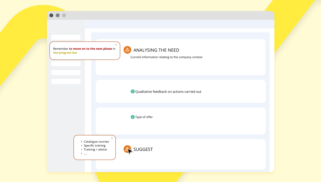
Standalone tooltip software, often part of a DAP (Digital Adoption Platform), works by overlaying a guidance layer on top of an existing application without modifying its source code. This means tooltips can be added to any web-based tool, including HRIS (Human Resources Information System), CRM, or ERP platforms, by teams with no access to the underlying codebase.
Key capabilities of enterprise-grade tooltip software include:
Contextual targeting: Tooltips are shown only on specific screens, to specific user roles, or at specific steps in a workflow.
Personalization: Content adapts to the user's department, language, or experience level.
Analytics: Usage data reveals which tooltips are triggered most often, indicating where users consistently get stuck.
No-code authoring: Content teams can create and update tooltips without developer involvement, keeping guidance current as software evolves.
What are the best practices for accessible, effective tooltips?
Tooltips must be accessible to all users, including those who rely on keyboard navigation or screen readers. Best practice guidelines converge on the following points:
Trigger on both hover and focus: A tooltip that only appears on mouse hover is inaccessible to keyboard-only users. It must also appear when the triggering element receives focus.
Keep text concise: Tooltips are intended for brief supplemental information. Longer explanations belong in a dedicated help panel or documentation page.
Do not put essential information only in a tooltip: If the information is critical to completing a task, it should be visible inline, not hidden behind a hover interaction.
Use sufficient color contrast: Tooltip text and background must meet contrast requirements so that all users can read the content.
Allow dismissal without movement: Users should be able to dismiss a tooltip by pressing Escape, without having to move their pointer away.
How does Lemon Learning deliver tooltip software for enterprise teams?
Lemon Learning is a DAP that integrates tooltip software directly into enterprise applications through a no-code overlay layer. Because no application source code needs to be modified, IT teams can deploy tooltips across CRM, ERP, HRIS, and other business platforms without a development sprint.
The platform supports the full tooltip lifecycle: authoring contextual content, targeting it by user role or workflow step, and measuring its effectiveness through built-in analytics. When usage data shows that users frequently trigger a tooltip on the same field, that signal guides the content team to review whether the underlying interface or the surrounding documentation needs improvement.
This analytics loop is one of the most important distinctions between a static tooltip added by a developer and tooltip software delivered through a digital adoption solution for IT teams. The former is a one-time addition; the latter is a continuously optimized guidance layer that evolves with the software and the user base.
Organizations that want to understand the broader context in which tooltips operate can explore the fundamentals of digital adoption to see how in-app guidance fits into a wider adoption strategy.
What is the return on investment of tooltip software?
The business case for tooltip software rests on four measurable outcomes:
Reduced helpdesk volume: When users can answer routine questions themselves via contextual tooltips, IT support teams handle fewer basic tickets.
Faster onboarding: New employees reach proficiency faster when in-application guidance accompanies each step of a workflow, reducing the time and cost of formal training.
Higher software utilization: Features that users do not understand go unused. Tooltips surface functionality that would otherwise be overlooked, improving the return on software investment.
Lower change management overhead: When an application is updated, tooltip content can be refreshed by content authors without developer involvement, reducing the cost of communicating changes to users.
Together, these outcomes mean that tooltip software typically delivers value well beyond its initial deployment cost, making it a practical tool for IT managers, project managers, and digital transformation leads who need to demonstrate tangible results from software investments.
FAQ
Frequently asked questions
What is a tooltip?+
A tooltip is a small contextual text bubble that appears when a user hovers over, focuses on, or taps a user interface element. It displays a brief label or description to help the user understand the purpose or function of that element without navigating away from the current screen.
What is an example of a tooltip?+
A common tooltip example is the password field on a sign-up form. When a user clicks or hovers over the password input field, a small overlay appears explaining the required format, such as minimum character length or the need for a special character. This is often called a password tooltip example in UX documentation.
What is another name for a tooltip?+
A tooltip is also known as an infotip, hint, mouseover text, or hover text. In accessibility contexts, the ARIA (Accessible Rich Internet Applications) specification refers to it using the tooltip role.
What is the difference between hover and tooltip?+
Hover is the user action, specifically moving a pointer device over an element, while a tooltip is the UI component that responds to that action by displaying supplemental text. A tooltip can also be triggered by keyboard focus, not only by hover, making it accessible to users who do not use a mouse.